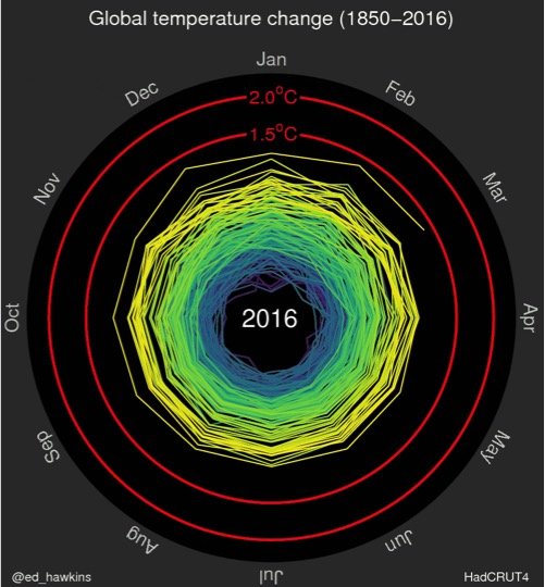
A new graphic boils down 166 years of data into a stunning 15-second animation that shows just how quickly global warming is spiraling out of control.
Ed Hawkins, a British climate scientist from the University of Reading, created the graphic to illustrate how global average temperature has changed since 1850.
Click here for animation to start
Continue reading this article on the website of USA Today
For your ‘latest world-wide news on climate change and adaptation’ please turn to our links underneath the map of Europe on our homepage


